The evolution of everyday banking
Delivering new and empowering experiences for ATB’s 700,000 retail web and mobile banking clients.
Overview
Client
ATB Financial
Role
Lead Product Designer
Product
Responsive web, iOS, and Android banking applications
ATB Financial is a Canadian financial institution offering a wide range of banking services, including personal, business, and investment products, with a focus on community-driven financial solutions.
As a Lead Product Designer I guided, mentored, and coached an ambitious team of designers, writers, and researchers as we evolved ATB’s web and native mobile retail banking products.
Highlights
What I am most proud of is the healthy, collaborative space we built that allowed us to learn, grow, and create top-notch work as individuals and as a team.
Thanks to that environment we delivered Web, iOS, and Android retail banking experiences 100% on time and to spec.
Notable experiences that my team delivered include
Replace debit card
Manage debit limit
SMS e-Transfer
e-Transfer history
Digital onboarding
Two-factor authentication
Customer identity and access management (CIAM)
Global transfers
View and manage account statements
ATM + branch locator
I created our team’s core design process, providing clear goals and deliverables. Overview below.
I set up consistent touchpoints with Product and Engineering to improve collaboration, transparency, and overall solution quality.
I structured and organized our Figma team space and created our scalable FigJam Discovery and Analyze file, and Figma Design file templates. We haven’t heard “Which one is the final design?” in years.
Our design process
I developed our design process to help our team achieve more effective, efficient, and successful outcomes by providing a clear structure and methodology for tackling design challenges. It drastically improved our consistency, collaboration, and creativity.
In-between each phase is a gate (a gentle pause) where we, as a team, ensure we are moving forward in the right direction.
Here’s a look at the six phases
Please note - Prior to kicking off this process the UX team and our partners in Product and Engineering have outlined the improvement we are trying to make, sized it, defined success criteria, etc and we build upon it.
We gather every piece of data that may help us understand our target audience and the scope of work.
We capture
what our target personas are saying, hearing, feeling, thinking, and doing
internal, external, and competitor experiences
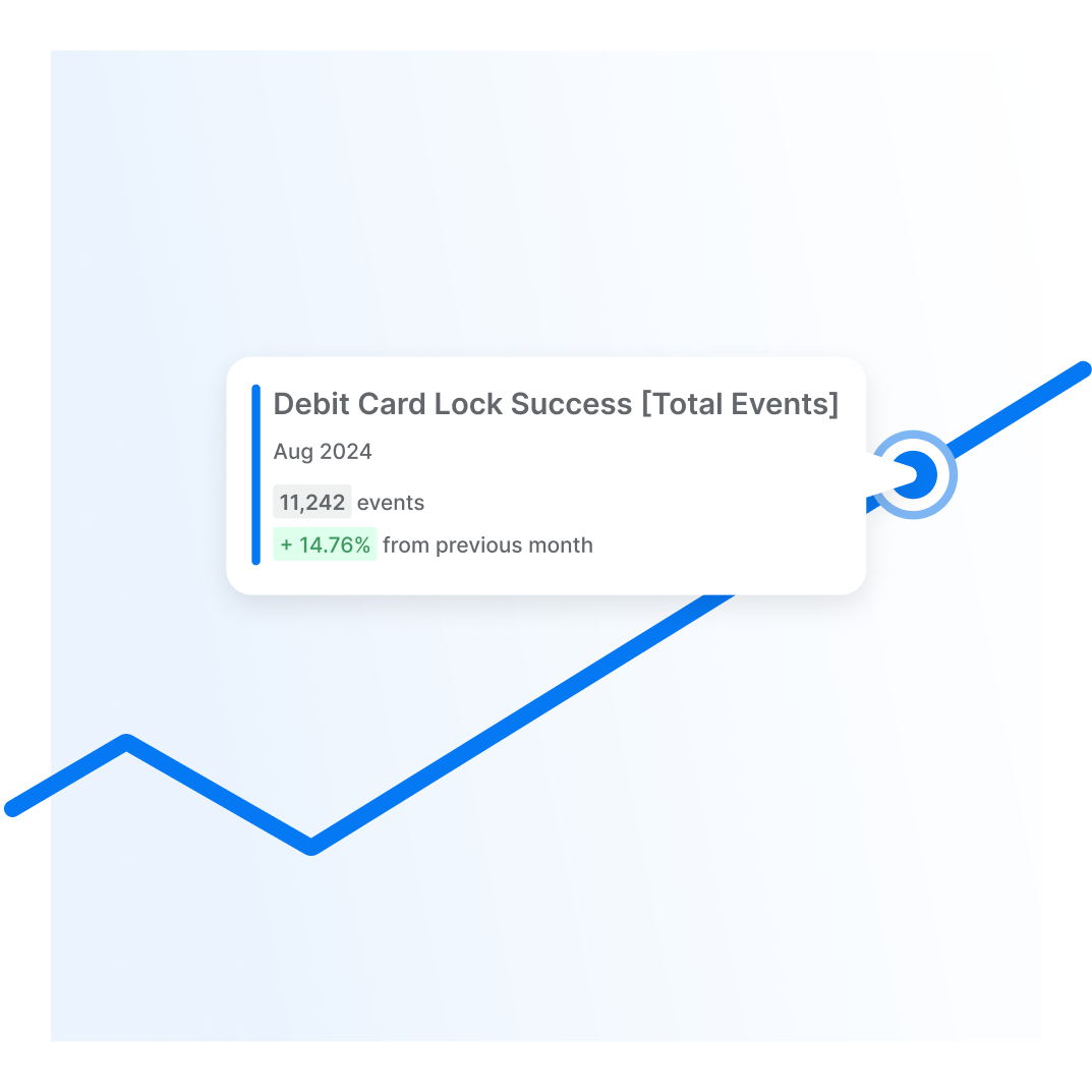
usage analytics
existing related research
technical, legal, and compliance considerations
questions and assumptions
1. Discover
2. Analyze
We extract the most important data from the Discover phase to develop a more complete picture of our target audience, the competitive landscape, and the path forward.
Deliverables include
Empathy maps
User stories
Client journey maps
Competitive analysis matrix
User flows
3. Ideate
Using the insights extracted from the Analyze phase, we generate a mass of ideas, good, bad, and everything in-between. Exploration is the name of the game.
Deliverables include
Sketches or wireframes of flows, screens, widgets, and icons
Lo-fi Prototypes
Testing
Content requirements
4. Design
We build on the most promising ideas from the Ideate phase. Design, prototype, gather feedback, and refine. Repeat until the experience meets our acceptance criteria.
Deliverables include
Hi-fi mock-ups, flows, and prototypes
Usability testing
Frame notes
Design Rationale
Partner demos
We remain engaged throughout the development process to support our partners and ensure our experiences are being built as intended.
Deliverables include
Refinement review with greater development team
One-on-one review with developer before they begin development
Ad-hoc progress reviews with developers during development
Sign-off on final product
5. Develop
6. Measure and Evolve
After some time in the wild, we dive back into the experience, chatting with clients and reviewing analytics. If it’s performing as expected, we’ll schedule another review for the future. If there’s room for improvement, we’ll make recommendations for next steps.
That’s our design process in a nutshell. It guided us through design challenges big and small, ensuring we delivered consistent, intuitive experiences every time.
Organization enhances efficiency
Keeping my team organized meant we spent more time focusing on creating and refining experiences and less time searching for info, resolving miscommunications, and reworking tasks.
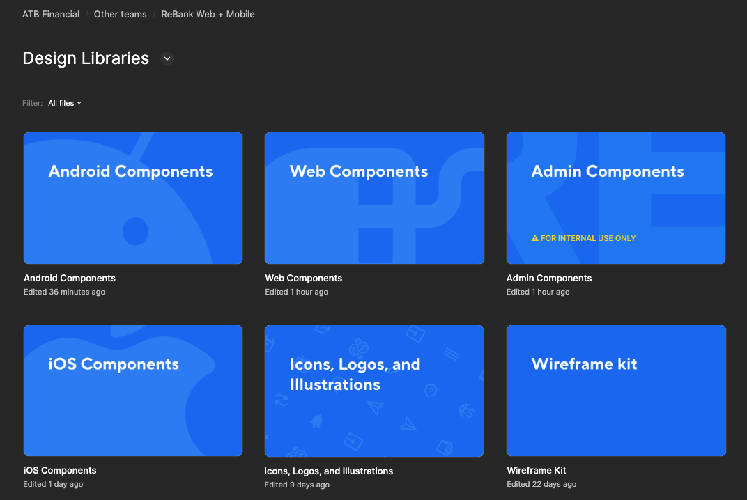
Design libraries space - a single location for all of the components used in our products.
The Fridge space - if it was important to our team, it could be found in The Fridge. Blue for design files, purple for FigJam files.
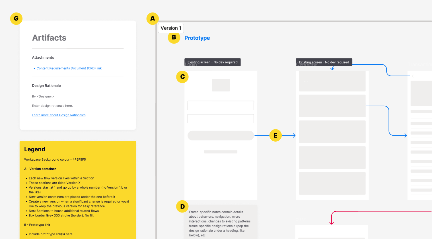
Scalable design file template - brought consistency and structure to our design files. Each section and widget is detailed within the legend. This was especially helpful to new designers joining our team.
Approval tags - brought clarity to the status of a design. This reduced miscommunication between designers, writers, and our partners.
Gate checklists - kept us honest and ensured we were ready to move forward.


